Getting Started with Web Development: Intro to CSS
Approx Time: 22 Minutes
Rishabh Pandey • March 25, 2021
CSS or Cascading Style Sheets is the language that we use to style an HTML file, and tell the browser how should it render the elements on the page.
A CSS file contains a bunch of rules that define how everything should be constructed on the HTML page. All of these rules have 2 parts,
- selector
- declaration block
A selector is used to specify which element should be styled and the declaration block specifies the actual style. Both of these together can be called a rule set. All CSS is nothing else but a bunch of rule sets.
p {
    font-size: 18px;
    color: yellow;
}

div {
    background-color: blue;
}
There are three ways to add CSS to a HTML Page
- link tag
<link rel=“stylesheet” type=“text/css” href=“style.css”>
- style tag
<style>
    ...
</style>
- inline style
<div style="">...</div>
Selectors
A selector is used to target a specific element or a set of elements on the page.
Every HTML tag has a corresponding selector, for example: div, span, img. If a selector matches multiple elements, all the elements in the page will be affected by the change.
As we learned in the HTML, there are two attributes which are commonly used to target elements. The class and id attributes, and the class can be repeated while the same id is only used for a single element.
- Classes are identified using the . symbol, while ids using the # symbol.
The whole point of keeping multiple elements with the same class name is that we are able to style all these elements by targeting the class.
<div>
    <p id="owner-name">John Doe</p>

    <p class="pet-name">Jojo</p>
    <p class="pet-name">Pogo</p>
</div>


// select by class

.pet-name {
  color: yellow;
}

// select by id

#owner-name {
  color: blue;
}
More selectors
- We can also target specific element that has a class or id.
<div class="card">
    <h2 id="welcome-message">Welcome to Site</h2>
    <p>We hope you have fun.</p>
</div>

div.card{
    border: solid;
}

h2#welcome-message{
    color: blue;
}
- We can also target multiple classes by combining class names, like this.
<div class="card">
    <h2 id="welcome-message">Welcome to Site</h2>
    <p class="message left">We hope you have fun.</p>
    <p class="message right">And you visit again.</p>
</div>

.message.left{
    float: left;
}
.message.right{
    float: right;
}
Classes and ids can also be combined similarly.
- We can apply same rules to multiple selectors by adding a comma between selectors.
<h3>My name is Rish</h3>

<p class="action">And I am here to help you.</p>

h3, .action {
  color: blue;
}
- We can create a more specific selector by combining multiple items to follow the document tree structure.
<div>....</div>
<div>
    <p>
        My name is:
        <span class="name">
          Rish
        </span>
    </p>

div p span.name {
  color: yellow;
}
The above selector will also work if the nested element is deeper in the structure. To get just the first level deep span we can use ‘>’ instead of space (‘ ’).
We have more selectors we can use like,
attribute selectors - These are used to select an element by its attribute. For example, a paragraph with id message can be selected by p[id=“message”].
pseudo class selectors Pseudo classes are predefined keywords that are used to select an element based on its state, or to target a specific child. There are many pseudo-classes like active, checked, disabled, hover, last-child etc. For example, a disabled can be selected by using a colon (:) like button:disabled.
pseudo element selectors Pseudo elements are used to style a part of an element, there are five supported pseudo elements,
- ::after - create pseudo element after the element
- ::before - create pseudo element before the element
- ::first-letter - style the first letter of text block
- ::first-line - style the first line of text block
- ::selection - target the selected text
Style Rules
Colors
We can add any color to our elements using three properties, - color - sets the color of text. - background-color - sets the color of the background. - border-color - set a color for the element’s border
To select a color we have - named color - a huge list of colors by name like red, blue, aqua, plum etc. - RGB and RGBa - RGB notation allow us to set color based on red-green-blue from 0 to 255. RGBa allows us to add an alpha unit (0 to 1) which controls the transparency. - Color Hex - The hexadecimal notation lets us express a number from 0 to 255 in just 2 digits, since they can go from 0 to “15” (f). So a RGB color can be expressed with 6 digits like rob(255,255,255) is FFFFFF.
<p>
This is a new <span>episode</span>.
<p>

p{
    color: white;
    background-color: rgb(0, 0, 0); // black
}

p span{
    color: rgba(255, 255, 255, 0.8);
    border-color: #ccc; // grey and same as #cccccc
}
Units
There are many units supported in CSS which can be used to assign height, width, padding, margins etc. to elements.
Most commonly we use, - px - Not the physical pixel on screen. This is the most common measurement unit you’ll find in CSS. - % - This allows us to specify a value based on the parent element’s corresponding property. - em - is the value assigned to element’s font-size, so the rule is relative to the font-size of the element (2em means 2 times the size of the current font) - rem - Relative to font-size of the root element (html). We set that font size once, and rem will be a consistent measure across all the page. - vw - Relative to 1% of the width of the viewport. The viewport is the user’s visible area of a web page. - vh - Relative to 1% of the height of the viewport.
There are also physical units like cm, mm, q (quarter of mm), in (inch) etc. These are used in print stylesheets which are used when we need to print a HTML document and are almost useless for screens.
URL
We can use @import to add another css file in the current one.
@import url(anotherfile.css)
To do import or add something like a background image we use the url method which searched the file relative to current directory of the css file or an external url.
div {
  background-image: url(logo.png);
}
CALC
The calc() function lets us perform basic math operations on values. Let’s say we need to have a div which is 20px less than 50% of the parent’s width.
div {
  width: calc(50% - 20px);
}
We can do addition, subtraction, multiplication and division in calc.
Backgrounds
There are many properties related to backgrounds, mostly we will need: * background-color - sets a background color * background-image - sets a background image with url() * background-clip - defines how far the background (color or image) should extend within an element. * background-position - sets a position of background within the element * background-origin - sets the background’s origin from the border start, inside the border, or inside the padding. * background-repeat - sets if a background should repeat and how * background-attachment - sets whether a background image scrolls with the rest of the page, or is fixed * background-size - sets the size of background and how much area it covers.
There is also a shorthand to apply multiple rules at once with a background.
background: bg-color bg-image position/bg-size bg-repeat bg-origin bg-clip bg-attachment;
Fonts
Just like background the font property is a shorthand for a number of properties.
- font-family - sets the font type like ‘Sans Serif’ or ‘Open Sans’
- font-weight - sets the boldness of a font
- font-stretch - sets a narrow or wide face of the font, if available
- font-style - sets whether the font is italic or normal
- font-size - sets the size of font in px, %, em or rem
font: <font-stretch> <font-style> <font-variant> <font-weight> <font-size> <line-height> <font-family>;
How to load a custom font? @font-face lets you add a new font family name, and map it to a file that holds a font. This file is usually one of the following type - woff (Web Open Font Format) * woff2 (Web Open Font Format 2.0) * eot (Embedded Open Type) * otf (OpenType Font) * ttf (TrueType Font)
To add a new font we can do something like,
// url is relative to the css file's directory

@font-face {
  font-family: myFontName;
  src: url(sansation_light.woff);
}

p {
  font-family: myFirstFont;
}
Font Styling
There are many rules available for typography. The most common ones are:
- text-transform - sets the case of the text: lowercase, uppercase, capitalize or normal.
- text-decoration - adds decoration to the text: underline, line-through etc
- text-align - sets the alignment of the text: start, end, left, right, center and justify.
- vertical-align - sets the vertical alignment of inline elements: baseline, top, middle, bottom etc.
- line-height - sets the line height of the text that is how much vertical space a line of text takes.
- word-spacing - modifies the distance between two words.
- letter-spacing - modifies the distance between two letters.
- text-shadow - adds a shadow to text.
text-shadow: h-shadow v-shadow blur-radius color; text-shadow: 2px 2px 8px #FF0000;
Box Model
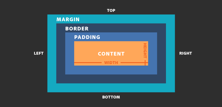
The box model explains the sizing of the elements based on a few CSS properties. Every element in CSS is like a generic box.
Starting from inside to outside we have: content area, padding, border and margin. Margin is the outer most layer of the box and touches the edge of box. You can open the dev tools on any browser and see this box model by clicking inspect.
By default, when we set a width (or height) on the element it is applied to the content area. All the padding, border, and margin are done outside of the value, so we have to keep this in mind when you do your calculation.
MARGIN The margin CSS property is used to add space around the element. The margin exists outside the border and touches the box model edges.
Margin has 4 properties, each relative to one side of the element box. Margin can be used as a shorthand for these.
- margin-top
- margin-right
- margin-bottom
- margin-left
We can set margin in the following ways:
We can use any unit like px, %, rem etc.

div{
    margin-top: 10px;
    margin-right: 5px;
    margin-bottom: 10px;
    margin-left: 5px;
}

div{
    margin: 10px; // all side padding 10px
}

// top and bottom - 10 px
// right and left - 5 px
div{
    margin: 10px 5px;
}

// the order is top-right-bottom-left
div{
    margin: 10px 5px 10px 5px;
}
PADDING The padding CSS property is used to add space in the inner side of an element. The padding exists between the content area and border.
Padding has 4 properties, each relative to one side of the element box. Padding can be used as a shorthand for these.
- padding-top
- padding-right
- padding-bottom
- padding-left
We can set padding in the following ways:
We can use any unit like px, %, rem etc.

div{
    padding-top: 10px;
    padding-right: 5px;
    padding-bottom: 10px;
    padding-left: 5px;
}

div{
    padding: 10px; // all side padding 10px
}

// top and bottom - 10 px
// right and left - 5 px
div{
    padding: 10px 5px;
}

// the order is top-right-bottom-left
div{
    padding: 10px 5px 10px 5px;
}
Note: * margin adds space outside an element border * padding adds space inside an element border
BORDER The border is a thin layer between padding and margin. By setting the border, we can make elements draw their outline on screen.
- border-style - sets the style of the border like: solid, double, dashed etc.
- border-color - sets the color of the border
- border-width - sets the border width or boldness: thin, medium and thick.
The border property is used as a shorthand for all of these.
border:
- border-radius - sets the curve on the border edges, can be used to create rounded corners.
BOX SIZING
The default behavior of applying the width and height to content area without taking padding, border or margin into account can be changed.
The box-sizing property has 2 values: * border-box - setting this will make width and height calculation include the padding and the border. * content-box - default
div {
  box-sizing: border-box;
}
Display
The display property of an object determines how it is rendered by the browser. This is a very important property and allows us to align elements easily.
There are many different display properties supported like: * block * inline * table * flex * grid * list-item * inline-block * inline-table * inline-flex * inline-grid * inline-list-item
And more. We will look at the basic ones now. We’ll not cover others including table, flex and grid. These are very important and you are advised to learn them on your own.
Inline All elements except div, p, ul and section are inline by default (these three are block). Inline elements have no margin or padding and any height and width properties will have no effect.
Inline-block Same as inline-block block but you can have height and width.
Block Block displayed items are stacked one after other vertical and takes 100% of the parent. So, it starts on a new line, and takes up the whole width. The values assigned to the width and height properties are applied, if you set them, along with margin and padding.
None Using display: none makes an element disappear. The item will not show up on the Html document. We can use this to hide status messages and alerts and switch the property when it’s relevant for them to be visible.
Positioning
The position CSS property allows us to move element around and position it exactly where we want.
It can have those 5 values: * static default setting and always positioned according to the normal flow of the page.
relative This allows us to position an element using an offset like top, bottom, right and left. Setting these four will move the element relative to its normal position.
absolute An element with position: absolute; is positioned relative to the nearest parent with a relative or absolute display. If an absolute positioned element has no positioned parent, it uses the document body. This setting on an element will remove it from the document’s flow.
fixed An element with position: fixed; is positioned relative to the viewport, and it always stays in the same place even if the page is scrolled. The top, right, bottom, and left properties are used to position the element.
sticky This is positioned based on the user’s scroll position. A sticky element toggles between relative and fixed, depending on the scroll position. Sticky positioning is a hybrid of relative and fixed positioning. The element is treated as relative positioned until it crosses a specified threshold, at which point it is treated as fixed positioned.
We can set top, left, bottom and right using any unit and it also supports negative values.
Float
Floating is used to place content on one side of the container (parent) element. The float property is used for positioning and formatting content e.g. let an image float left to the text in a container.
The float property can have one of the following values: * left - The element floats to the left of its container * right - The element floats to the right of its container * none - This is default, element does not float.
There is a clear property which specifies on which sides of an element floating elements are not allowed to float.
If an element can fit horizontally in the space next to another element which is floated, it will. Unless you apply clear to that element in the same direction as the float. Then the element will move down below the floated element. You can think of clear like it clears any unwanted float that may get applied to it because of empty space in floated sibling elements.
clear: both | left | right ;
<p>...</p>

<img src="pineapple.jpg" alt="Pineapple">

<p id="p2">...</p>


img{
    float: right;
}

p#p2{
    clear: both;
}
Lists
Lists are super useful in web pages. A list of items, navbars and many more things are made using lists.
There are many properties to style
Like many other list-style provides a shorthand like:
list-style:
Responsive Design and Media Queries
There are several media types supported by CSS like: - all - applies on all media types - screen - used for screen (default) - print - used for printing - speech - used for screen readers
Media queries are useful when you want to modify your site or app depending on a device’s general type (such as print vs. screen) or specific characteristics and parameters (such as screen resolution or browser viewport width). So we can apply css to any media type (screen, print etc) or any device width like a mobile, tablet or desktop.
Targeting media types Although websites are commonly designed with screens in mind, you may want to create styles that target special devices such as printers or audio-based screenreaders. For example, this CSS targets printers:
@media print { … }
We can also target multiple devices. For instance, this @mediarule uses two media queries to target both screen and print devices:
@media screen, print { … }
Many media features are range features prefixed with “min-“ or “max-“ to express “minimum condition” or “maximum condition” constraints.
For example, to apply CSS to devices with max viewport width of 1200px we can use
@media (max-width: 1200px) { … }
A list of commonly used media queries to target specific device sizes.
// Small devices (landscape phones, 576px and up)
@media (min-width: 576px) { ... }

// Medium devices (tablets, 768px and up)
@media (min-width: 768px) { ... }

// Large devices (desktops, 992px and up)
@media (min-width: 992px) { ... }

// Extra large devices (large desktops, 1200px and up)
@media (min-width: 1200px) { ... }
Normalizing CSS
All browsers have a basic set of CSS rules for styling HTML pages, our custom CSS sits on the top of the browser’s CSS. Since, all browsers have a slightly different implementation of their CSS, to provide the user with a consistent experience across all browsers we need to normalize or override the browser’s CSS.
Normalize.css is the most commonly used solution for this problem. Normalize.css makes browsers render all elements more consistently and in line with modern standards. It precisely targets only the styles that need normalizing.
You must load the normalizing CSS file before any other CSS.
THIS WAS AN EXCERPT TAKEN FROM A WEB DEVELOPMENT BOOTCAMP I TAUGHT. EVERYTHING IN THE ARTICLE IS MOSTLY UNEDITED AND NOT DESIGNED FOR THIS BLOG YET.